

Colour mixing takes just as much skill as applying paint to canvas. For artists, it can be incredibly frustrating to struggle to find the exact right shade of paint. When you have visualised the colour you need, nothing should stand in the way of you creating that colour. Whether it’s a bright yellow, a deep blue, or burnt orange, acrylic paints lend themselves to being mixed to find the right shade.
While colour theory and wheels play a huge part in knowing how to mix paint colours, it also comes with time. Practice makes perfect, and when you become accustomed to the acrylic paint brand of your choosing, you will learn how to quickly perfect your desired shades. However, if you’re after some tips or looking to brush up on your acrylic paint colour mixing, look no further.
Know Your Colours
Before breaking out the acrylics and paint palettes, it’s a good idea to have a basic understanding of how mixing colours can create new shades. Experienced painters will have picked up an instinct about which colours will mix to create the right shades, but students and those new to acrylic paints may need some guidance.
Primary, secondary, and tertiary colours may sound like complicated terms at first but are easy to visually understand, especially with the help of a colour wheel. Colour wheels display how primary colours can be mixed to create secondary, how secondary colours mix to create tertiary and so on. This will embed a sense of which colours to mix to achieve your desired shade or hue, and colour theory can quickly be mastered with practice.
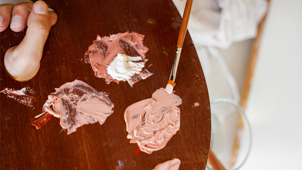
Colour Families
The process of learning how to mix paint colours is full of picking up tips and tricks like this one. When you have achieved the ideal shade for an aspect of your artwork, it’s an excellent idea to then create a family of tones around this shade. This is achieved by creating different ‘versions’ of your initial shade, one made by adding blue, another by adding red, and so on. Most acrylic artwork is not flat – you will need different shades to create light, shadow, and nuance to the object, landscape, or person. Creating this range of shades from the start is an excellent way for your painting to have consistent colours without you having to remember all the paints and amounts you added to your mixing palette.
Write That Down
When searching for the right shade, you might want to document your experimentation and create your own personal acrylic paint colour mixing guide. This can look however you want it to, but make sure to note down the rough proportions of each acrylic colour you added to achieve your final shade. This will save you a lot of time and paint in the long run and ensure you can reuse colours over and over again. You can also save premixed shades in airtight mixing pots or even in old film canisters, ready to be used again.
Not Everything is Black and White
These two polar-opposite shades are two of the most important colours to include in your palette. They both have extreme power over your shades, with the potential to make or break your shades, and here’s why.
With so many uses, it’s probably a good idea to have plenty of white acrylic paint on hand while you mix colours. If you want to lighten your paint shade, white is the obvious choice to do so, though it will also make a shade cooler than you desire.
White paint is also an excellent addition to a colour that requires a bit of boldening. Colours can appear brighter and more interesting than straight out of the tube if you add a little white before applying it to your canvas. What’s more, you can also increase a colour’s opacity, reducing opaqueness and meaning that colours do not appear so overbearing on the canvas. They can work better with underlying layers of paint or even show the colour of your painting surface if you wish.
Now, on to black. It might make sense that, in the same way that adding white can lighten a paint shade, adding black will simply make your paint colour darker. This is unfortunately not the case. Mixing black into a paint shade will normally create a muddier, murkier shade than you are intending. To make colours darker, brown or deep blue acrylics paints are the best choice for more natural looking colours.
Source: https://www.cowlingandwilcox.com/blog/post/7-a-cheatsheet-acrylic-paint-colour-mixing-guide

