

A Contrast Art Definition: What Is Contrast in Art?
Contrast in art refers to the use of opposing elements or qualities to create visual dynamics and capture the viewer’s attention. This can include contrasting colors, shapes, textures or lines that create a sense of balance and interest in the artwork. Contrast can also be used to convey emotion, create tension, or emphasize certain elements within a composition. In general, contrast plays a crucial role in enhancing the impact and effectiveness of artistic works.
Contrast is a fundamental element in art that involves the use of divergent elements that are intentionally juxtaposed to stimulate visual interest and achieve the desired impact.
The benefits of using contrast in artwork
The use of contrast in art offers several benefits to both the artist and the viewer:
- Enhances Visual Interest: Contrast draws attention to specific areas of a composition, making them stand out and appear more prominent. This can be particularly useful when an artist wants to highlight certain elements or create focal points within their work.
- Creates Depth and Dimension: Through the use of contrast, artists can create an illusion of depth and three-dimensionality in their artwork. For example, using darker values on the bottom half of a painting and lighter values on the top half can give the impression of a receding background and a closer foreground.
- Establishes Focal Points: Contrast helps to guide the viewer’s eye through the composition by establishing focal points. These are areas of the artwork that have a higher contrast than the surrounding elements, making them more noticeable and drawing attention to them.
- Balances Composition: Effective use of contrast can help to achieve a sense of balance within a composition. By distributing contrasting elements throughout the piece, artists can prevent any one area from dominating and create a more harmonious overall appearance.
- Communicates Emotion: Contrast can also be used to evoke emotional responses from viewers. For instance, a stark contrast between warm and cool colors may create a sense of tension or drama, while a softer contrast between muted tones might convey a feeling of calmness or serenity.
- Highlights Texture and Form: In addition to color and value, artists can use contrast to emphasize differences in texture and form. This can add visual interest and depth to the artwork, making it more engaging for the viewer.
- Enhances Storytelling: In narrative art, such as illustrations or comics, contrast can be used to guide the viewer’s understanding of the story. By contrasting different characters, objects, or environments, artists can clearly communicate the relationships between them and direct the viewer’s attention to important details.
Incorporating contrast into artwork can greatly enhance its visual appeal and effectiveness in conveying the artist’s intentions. By thoughtfully employing contrast in elements such as color, value, texture, and form, artists can create captivating pieces that engage viewers and leave a lasting impression.
Exploring the Different Types of Contrast in Art
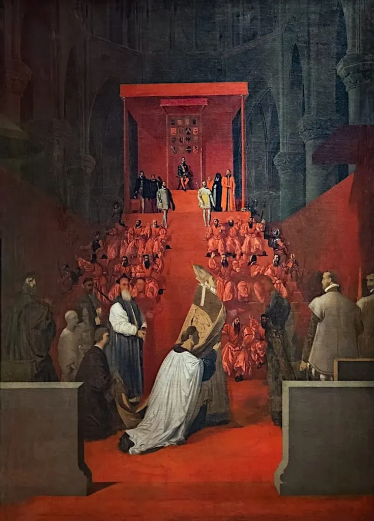
Contrast is a fundamental aspect of visual art as it helps to highlight certain elements and create a sense of depth and dimension. There are several types of contrasts that can be found in art, including color contrasts, tonal contrasts, textural contrasts, and compositional contrasts.
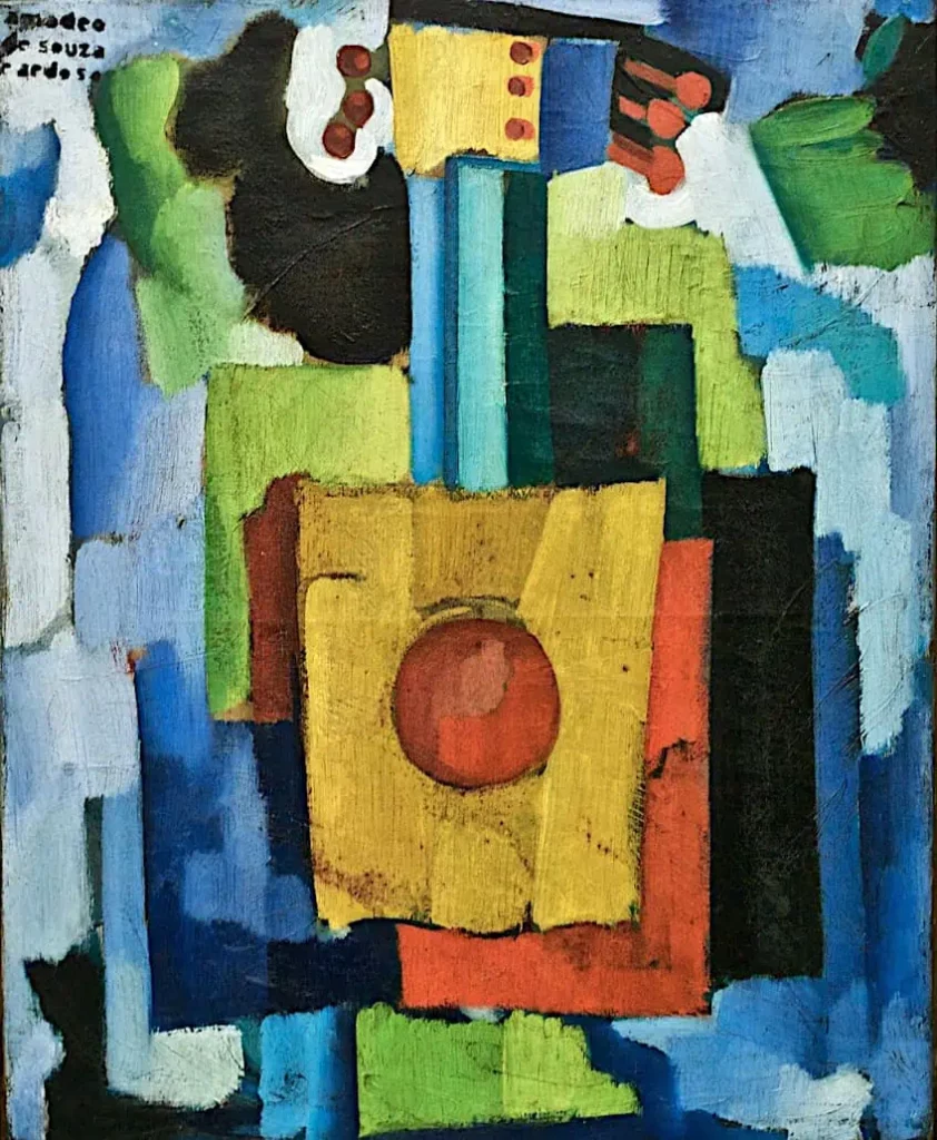
Color Contrast: This involves using complementary colors or opposing hues to create visual interest. For example, red and green are complementary colors that, when used together, can make each other appear more vibrant. Similarly, using warm colors like reds, oranges, and yellows alongside cool colors like blues and greens can also create a striking contrast.
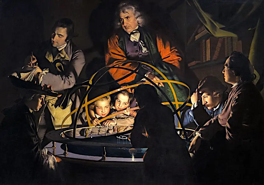
Tonal Contrast: This involves using different levels of light and shadow (tones) to create differences in the perceived value of elements within a picture. Artists often use tonal contrast to direct the viewer’s eye to certain areas of a composition or to create a sense of volume and three-dimensionality. For example, in a portrait, an artist might use softer, less detailed areas for the background and brighter, more detailed areas for the subject’s face, creating a tonal contrast that draws attention to the face.
Textural Contrast: This type of contrast is achieved by combining smooth, shiny surfaces with rough, matte textures, or by using different materials to create a variety of tactile sensations within a single work of art. Textural contrast can help guide the viewer’s eye through the composition and add interest and depth to the piece. For example, a soft, fluffy blanket can be placed next to a hard wooden table, creating a textural contrast that draws attention to the contrast between the two materials.
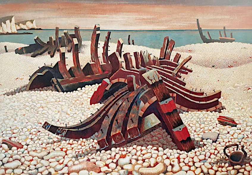
Compositional Contrast: This involves the use of shape, size, position, and other visual elements to create tension and dynamics within a composition. Compositional contrast can help guide the viewer’s eye through the artwork and encourage them to explore different areas of the piece. For example, a large, empty area of the canvas can be balanced by a group of small, nearby objects, creating a compositional contrast that draws attention to both the void and the group.
- Size Contrast
Many artists create size contrast regularly but may not realize that they do. By contrasting elements according to their opposite proportions, you can create a work that conveys intention and emphasizes the mood, subject, and emotional impact of the work.
- Shape Contrast
Creating shape contrast allows for more experimentation since shapes can be presented as organic, geometric, small, large, and warped. There are many possibilities in terms of juxtaposing shapes against one another, which can affect the design of your work.
Exploring the Different Types of Contrast in Art
Many famous works of art demonstrate the skillful use of contrast, be it color, tonal, textural or compositional. Here’s a few examples:
• “Starry Night” by Vincent van Gogh: This iconic painting shows an excellent example of color contrast. Van Gogh uses bright, vibrant shades of blue, yellow and green to depict the night sky, creating a dramatic contrast with the earth tones of the land and village below.
• “Mona Lisa” by Leonardo da Vinci: In this famous painting, Da Vinci used subtle tonal modeling to convey the depth and shape of Mona Lisa’s face. The light falls on her cheek, casting shadows on the other side of her face, creating a high tonal contrast that adds realism and volume to her image.
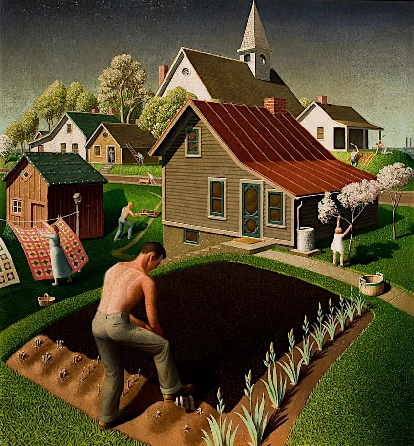
• “American Gothic” by Grant Wood: In this American classic, Wood uses a combination of color and compositional contrasts to create a sense of tension and disharmony. The bright, rich colors of the house and garden behind the couple contrast sharply with their more muted, earthy clothes, while their stern expressions contrast with the peaceful nature around them.
• “The Great Wave off Kanagawa” by Harukitsu Hosoe: This famous Japanese print demonstrates Hosoe’s mastery of textural contrast. The smooth, glistening waters of the ocean contrast with the sharp edges and foam of the crashing wave, creating a dynamic and captivating image.
These masterpieces, among many others, illustrate the power of contrast in art, demonstrating how it can be used to create visual interest, convey emotion, and provoke thought in the viewer.
In conclusion, contrast plays a crucial role in creating visual appeal and depth in art. By understanding and using different types of contrast – color, tonal, textural and compositional – artists can manipulate the viewer’s perception and create compelling artwork that engages and inspires.
Source: ARTMEDIA

